Kuahiwi Surf Shop Identity
Overview
Kuahiwi Surf Shop is a surfboard shop located in O’ahu, Hawaii. Being in an area known for it’s world-class surfing appeal brings in a lot of professional surfers from across the globe just to ride the waves. But with the highly-skilled surfers brings a sense of intimidation to those just beginning.
Kuahiwi Surf Shop aims to help surfers of any skill level to get better by selling the best equipment for purchase and rental and providing surfing classes.
The surfboard shop’s audience includes tourists who are just starting to the professional surfers looking to upgrade their equipment.
“Kuahiwi” is Hawaiian for mountain. The shop’s name refers to the idea that anyone can surf the largest waves and the employees and teachers who work at Kuahiwi Surf Shop want to help you get there.
Finding the Right Direction
For Kuahiwi Surf Shop, I needed to consider the target audience who are surfers at various levels.
How can I visually attract both the beginners and the professionals if they haven’t heard of the surf shop yet?
For the tourists and beginners, I needed to come up with something that would be recognizable. Most everyone has seen the popular surfing brands, which reasonably use a wave in their logo. If I was going to do this, I needed a way to make it unique and recognizable to stick out from the crowd.
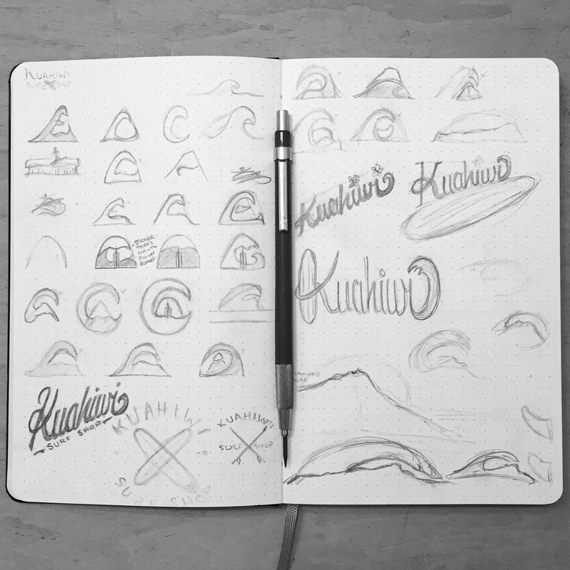
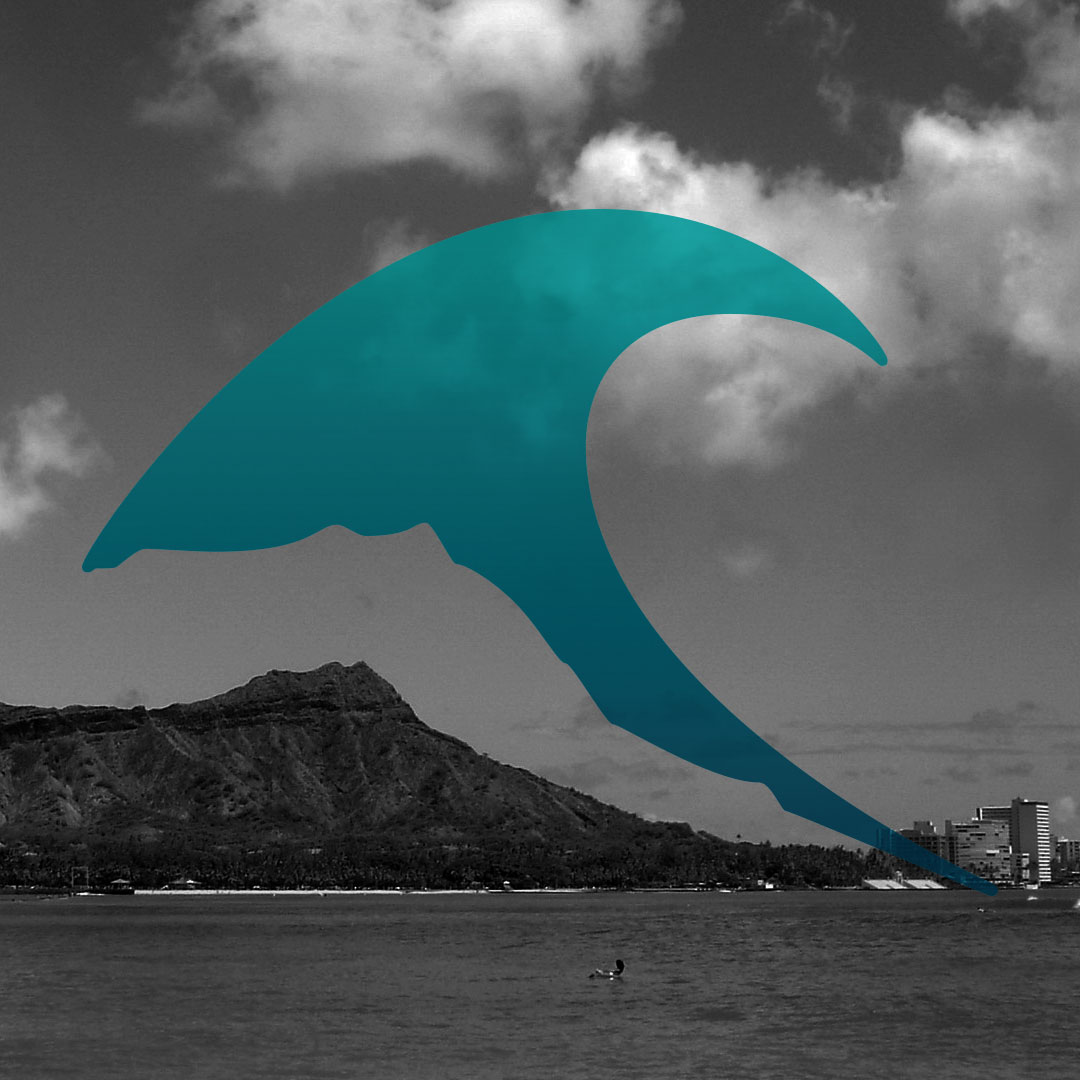
The solution was in the name of the shop. I was going to use Diamond Head – the volcanic cone and a distinct landmark on Oahu in combination with the wave.
For the skilled and professional surfers, I needed something that would stick out while looking sleek and professional – traits that they look for in the equipment they purchase. This is more on an aesthetic in appearance which meant having clean smooth lines even with the texture of Diamond Head.
Refining the Mark
It’s been said that there’s nothing new under the sun. There are times where the designer tries to come up with an original design, but is still influenced by his life experiences.
I found that my first iteration appeared to be too similar to the Quicksilver logo and needed to change the direction a bit.
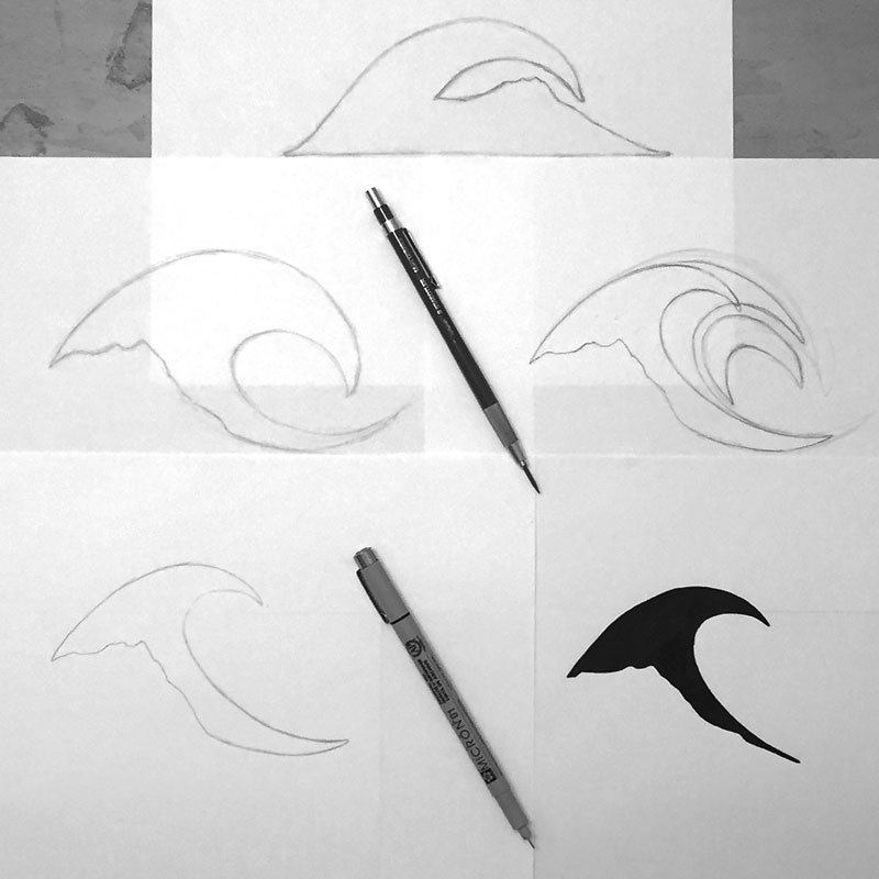
As I refined the mark, I found that thinning out the wave and having the profile of Diamond Head cut off the bottom of the wave created a balance without symmetry and provided an organic, more natural appearance while appearing sleek and smooth.
Custom Lettering
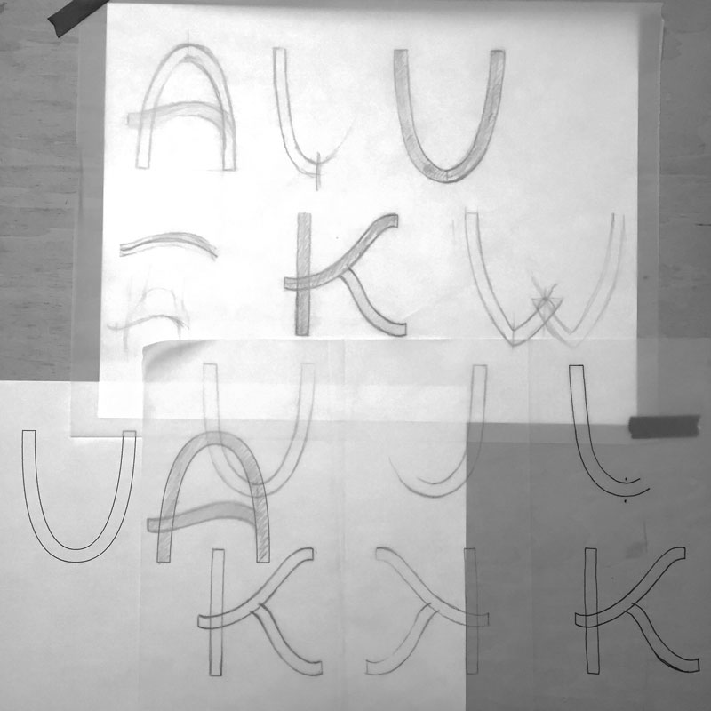
“Kuahiwi” needed to be more than just a font that was picked out. It needed to be as unique as the client, so I chose to hand letter a custom type for the name.
The type I created is a sans serif type where the K and crossbars of the A and H are made up of wavy lines to imitate the waves of the ocean. I also designed the curvature of the U, and A are to mock the curves found in surfboards, While the shape of the W pulls hints from a swallow tail surfboard.
To create uniformity, I designed the letters using a grid as seen below.

Final Concept
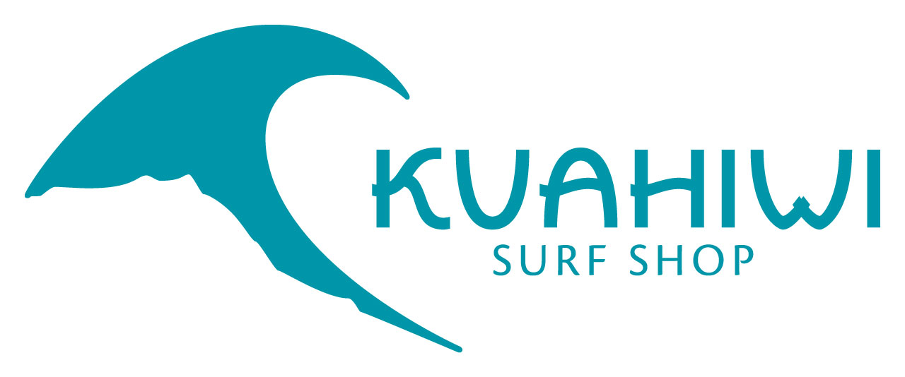
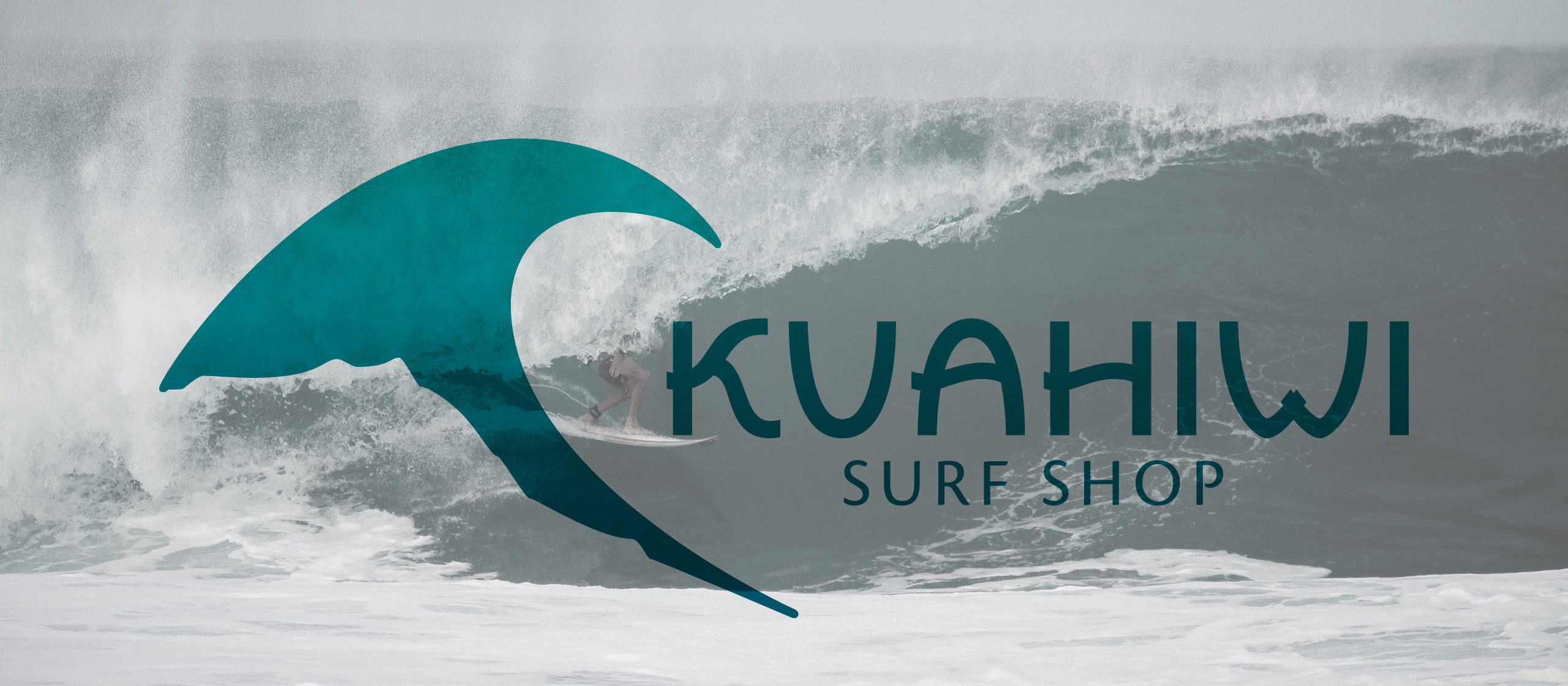
The final concept is a combination mark composed of a unique symbolic mark that can stand on its own, but when combined with the hand lettered type, creates a solid visual mark that’s recognizable and memorable.
The wave obviously symbolic of the ocean and where people surf while the mountainous terrain that cuts off the bottom is the profile of Diamond Head, a prominent feature of O’ahu.
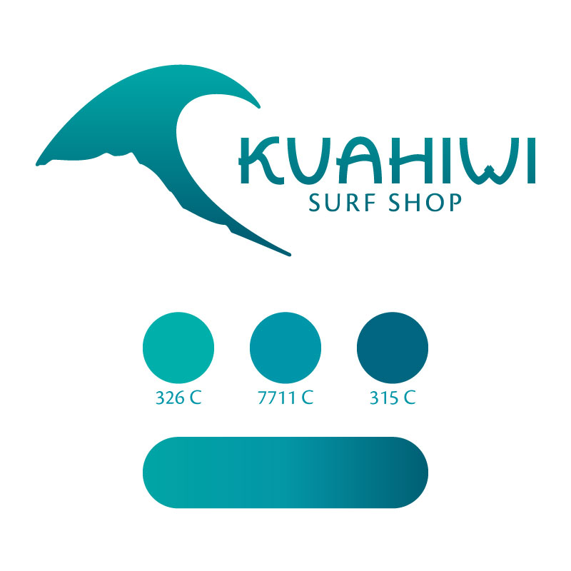
The colors used in the logo are found in the ocean itself creating a smooth gradient from dark aqua to cool blue. Then for typical application, the middle blue, Pantone 7711 C, is to be used.
No matter if the customer is a tourist interested in trying out surfing for the first time or a professional surfer looking for a place to get some new gear, this logo will capture their attention and invite them to visit the Kuahiwi Surf Shop.
Are you interested in working with me on your own branding identity?
Let's talk!
