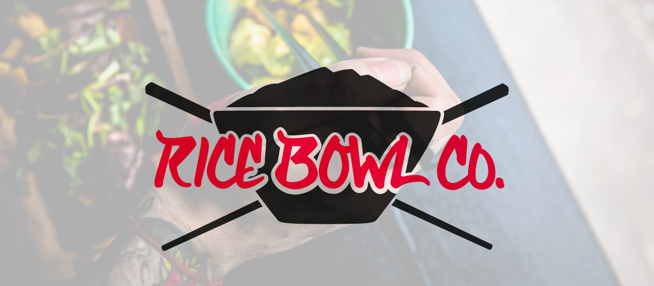
Rice Bowl Co. Logo
Overview
Rice Bowl Co. is a food truck run by two brothers and their childhood friend preparing Californian Japanese cuisine in the form of rice bowls.
Despite being encouraged by their parents to go to college to obtain high-paying corporate jobs and live the “American Dream,” they knew the corporate life wasn’t for them, so they made their own plans.
They wanted to make a name for themselves by providing the people of the Los Angeles area with fresh food that would leave you feeling fulfilled without the desire to take a nap like a lot of the typical greasy food truck food did.
Rice Bowl Co. takes pride in using fresh fish and meats, local organic vegetables, and a mixture of black and white rice in their dishes.
Each meal comes in a compostable bowl and bamboo chopsticks to be environmentally friendly and make it easy for customers to dispose their refuse.
Considering the varying environment and heavy competition as a food truck, Rice Bowl Co. needed a logo that would be bold, eye catching, and attractive to the hungry passersby.
Finding Direction
With the understanding that this logo needed to immediately attract people walking or driving by, the logo needed to be simple enough, yet interesting and memorable.
I knew by keeping the logo mark fairly basic, but incorporating a distinct character, I could design a logo that would grab the audience’s attention.
The Process
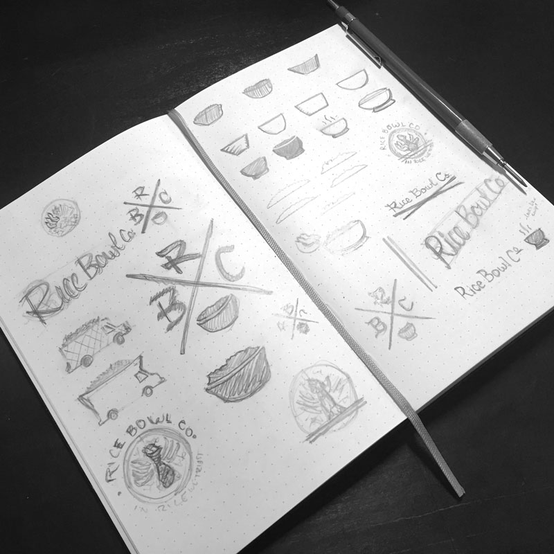
I started by working on the logo mark considering the product itself as a visual representation of the business which would also provide a quick visual explanation to their audience so they would know what kind of food to expect.
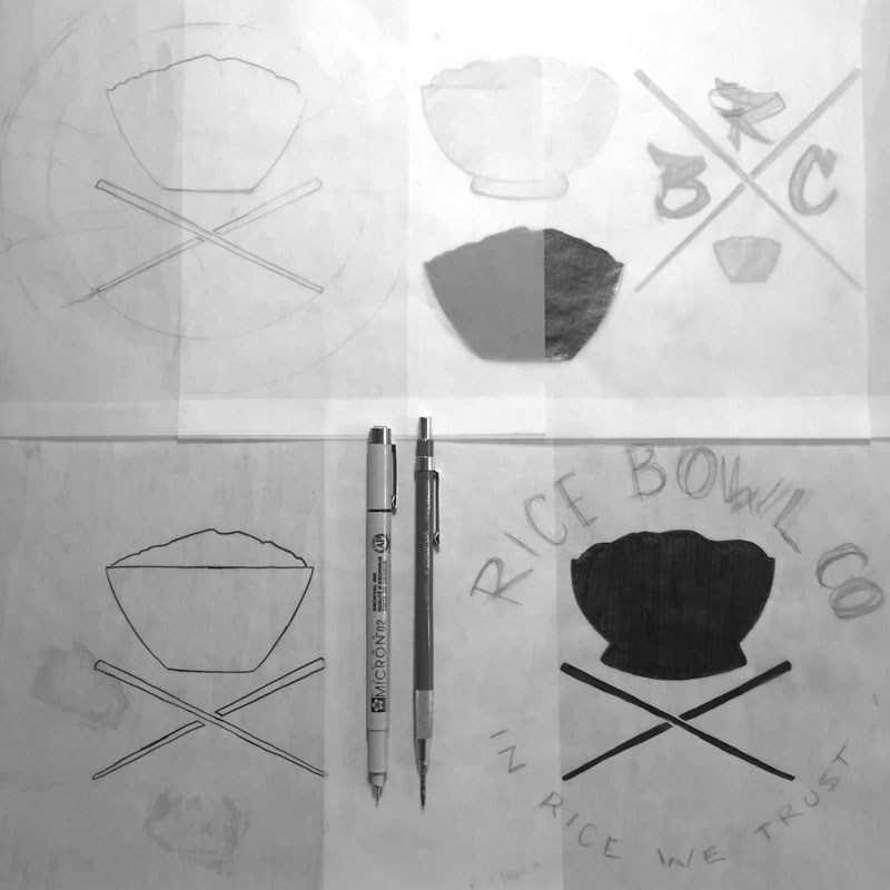
I played with a few different visual compositions considering different views of the rice bowl, layout of the logo, and even using the truck itself as a bowl. I eventually came to the conclusion of using a simple bowl overflowing with rice and chopsticks would best visually communicate the client because it’s simple, gets to the point quickly, yet with the right style, can be memorable.
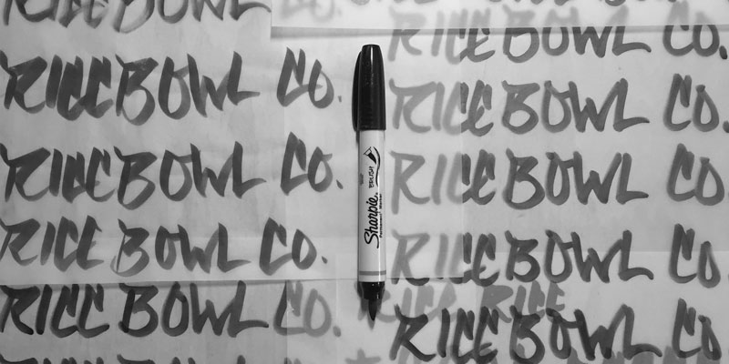
The next step was to choose what to do with the word mark. I could either find an appropriate font or I could hand letter the business name. I chose the later because it allowed me to create the perfect style to match my client.
The Details
The bold, rich black and bright red colors quickly grab the attention of every passerby. The red is similar to that used on the Japanese flag – a way of recognizing the owners’ heritage.
The hand-lettered script type used for the word mark also recognizes the client’s Japanese ancestry, but the graffiti-like street style references their somewhat anti-establishment mentality of not becoming the businessmen their parents wanted.
Without needing to read the name, the rice bowl and chopsticks can quickly visually communicate the style of food being served from the food truck.
I also designed a simple cross logo which retains the same characteristics of the main logo that can be used a smaller and other specific applications.
Final Concept
Rice Bowl Co. needed a logo that would help them stick out from the noise of busy streets and attract other hungry people to their food truck instead of the many others around.
This final design has a bold style with unique character which not only grabs the audience’s attention, but retains it and is memorable.
The edgy style and attitude of the client to go against the flow of what they were raised to be is another distinct trait represented in this logo through the graffiti-like calligraphy.
The sharp contrast of black, white, and bright red add to the strength of the logo helping this design achieve the goal of truly catching the eye of every passerby.
Are you interested in working with me on your own branding identity?
Let's talk!
