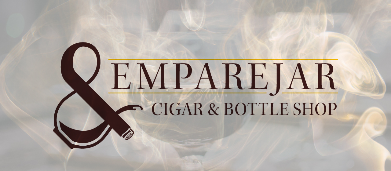
Emparejar Cigar & Bottle Shop Logo
Overview
Emparejar Cigar & Bottle Shop based in Ybor City – a neighborhood in Tampa, Florida, formerly known as the Cigar Capital of the World. As their name suggests (Emparejar means “to pair” in Spanish), they focus primarily on pairing cigars with craft beer and liquors.
While this hobby is typically sought after by rich older men, Emparejar’s biggest challenge is trying to reach and encourage the younger generation in their upper 20’s through 30’s to explore this more mature hobby. With a logo that can attract both generations, the shop will be able to continue business long into the future.
Finding Direction
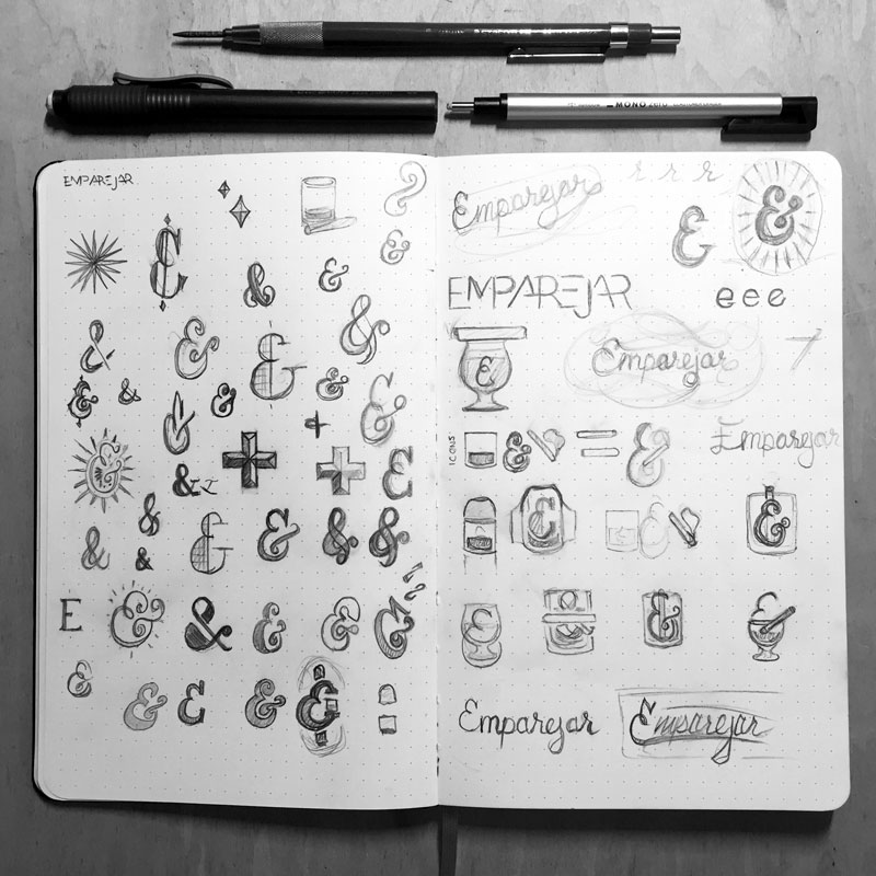
With a name meaning “to pair,” and the products being sold at this store, the best direction was to use an ampersand. It is a symbol that is both fun to look at, but when done correctly, has a distinct elegance about it. So, I spent a good amount of time just experimenting with different styles of ampersands to find the one that would attract the right audience.
I ended up using a traditional ampersand style since it appears professional and has an upscale feel.
This style was also going to lend itself nicely to add some playful aspects to it.
The Process
Once I had found the direction of using the ampersand for it’s sophisticated style, I just needed to figure out a way to also make it playful. The way I thought to do this was by incorporating the products into the shape of the ampersand. This would maintain the complexity of the ampersand, but with the creative infusion of a cigar and a drink would keep this logo interesting to the target audience.
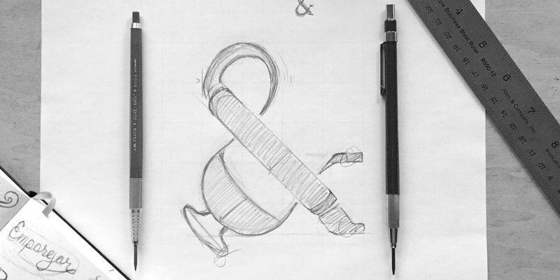
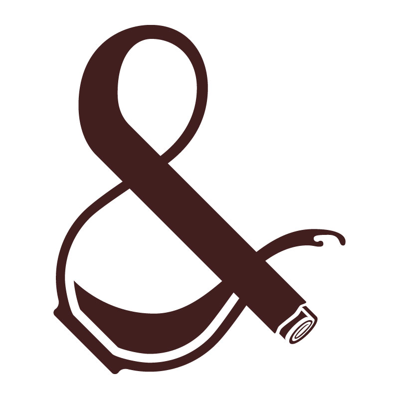
I found by using a glass for the bowl of the ampersand that would spill to create the arm and having the leg be made up of a cigar, I was starting to find the charming character I was looking for.
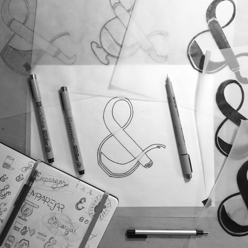
I ended up working out a few iterations in this direction mainly with the goal of simplifying the logo while still maintaining a unique character.
I experimented with different styles of the glass including a snifter, an old fashioned glass, and eventually a stemless snifter.
I also worked out the leg of the ampersand with a cigar. I originally had the full shape of a cigar with ash and smoke, but I knew this was too much. I started to filter down the detail until I got to just the ash with a swirl. It’s just enough to represent a cigar, but also without the detail to create an overcomplexity in the logo.
The Details
The playfulness incorporated into this elegant character carries a lot of meaning for as simple as it is.
First and foremost, since Emparejar means “to pair” in Spanish, the ampersand provides a visual to the name. This unique character naturally has a luxurious and sophisticated style which was needed to attract the more refined lifestyle.
To represent a cigar, one of the two items Emparejar sells and pairs, I substituted the foot of the ampersand with ash. Ironically with how subtle it is, it is also noticeable since it cuts the foot off making the unique shape of this ampersand memorable.
To represent the other product they sell and pair with cigars, a drink is incorporated into the bowl of the ampersand. The bowl is created with a stemless snifter and playfully spills out into the arm of the ampersand which is playfully capped off in the shape of a bottle opener.
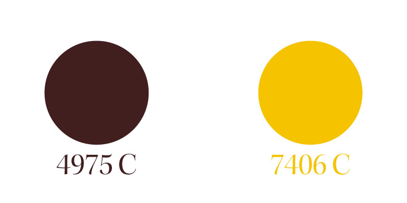
For the colors, the logo makes use of dark brown and warm yellow to feel luxurious, warm, and inviting.
Final Concept
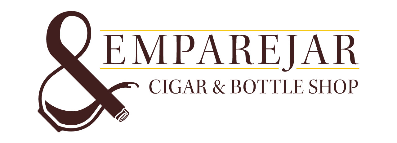
To help Emparejar be approachable by both the mature cigar smoker and the younger-but-intrigued 20-somethings, the shop needed a visual identity that would be both sophisticated, but interesting.
With the use of a traditional ampersand, the final version of the logo possess the elegance pleasing to the older generation.
At the same time, to avoid a feeling of exclusion, the creative infusion of both the cigar ash and spilling drink keeps the attention of the younger and interested audience.
Although, the audience is somewhat diverse in age, the logo possess a luxurious character through type and color that attracts the more cultured crowd.
To summarize, the final concept is a logo that is both versatile and timeless. It attracts the richer, retired gentleman who occasionally spends an evening with a cigar and a nice scotch. It also encourages a longer relationship with the younger businessmen interested in a hobby to appreciate with potential clients on the golf course.
Are you interested in working with me on your own branding identity?
Let's talk!
