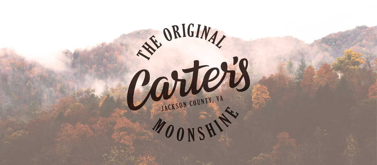
Carter’s Moonshine Logo
Overview
Carter’s Moonshine has been in the underground liquor distilling business since the late 1800’s. With a secret recipe that is handed down from generation to generation, the fourth generation has just started to pick up the business, the great grandson has decided to make the business’s brand a little more professional to compete against the commercial liquor companies.
Direction
Considering the history and future of the company, the goals was to design something that would portray the history of the business while being timeless. To reflect the nature of the family and the attitude they have about their business and the joy they get out of it, the logo also needed to have a hint of fun.
With that in mind, a script hand-lettering style would be appropriate because it would achieve these goals while also communicating the attention to detail they put into their craft.
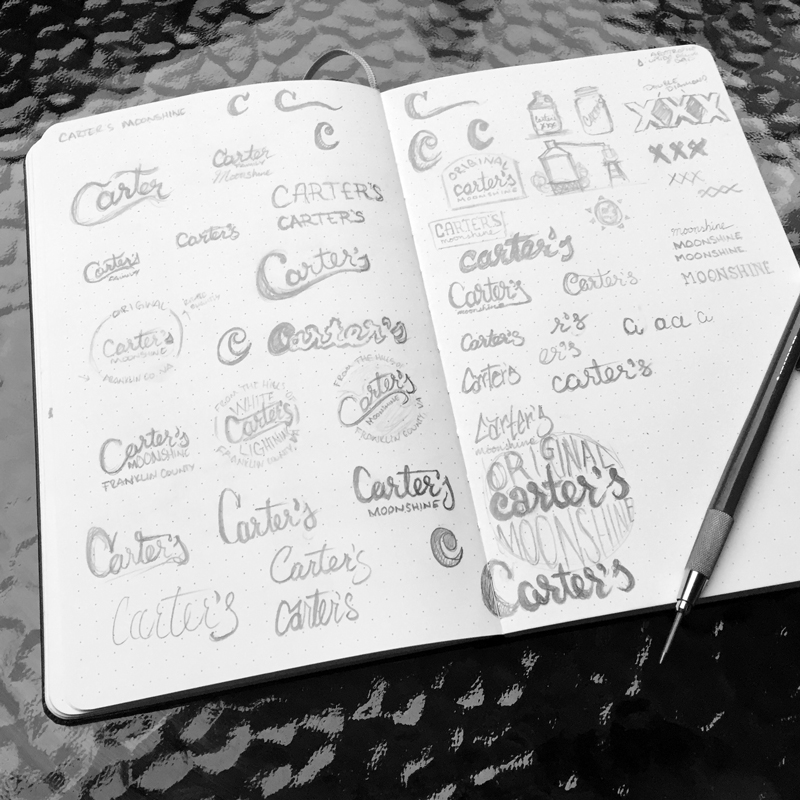
Process
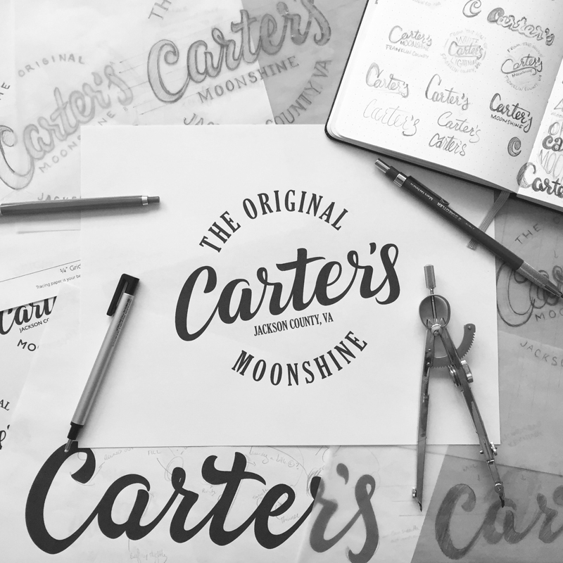
Details
Just off the bat, one will notice the script style which gives this logo a classic appearance while not holding onto a specific timeframe this way it gives a nod to the company’s history, but keeps the logo timeless.
Instead of being horizontally straight, the logo is rotated 10 degrees to add a bit of playfulness of Carter’s Moonshine and the way you feel as you consume the product.
The script has been designed to work at both large and small scale so no matter where it is applied, it can be legible and recognizable.
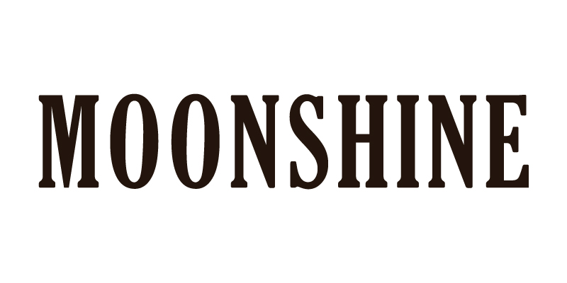
For the encircling type, I chose Gloucester Extra Condensed for it’s appropriate character and legibility. It also makes for a distinguishable header type for the visual identity.
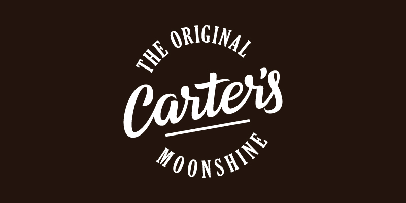
Final Concept
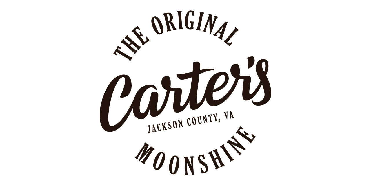
The goal for the Carter’s Moonshine logo was to design a visual symbol that portrays the history and future of the company while maintaining a fun appearance based on the personality of the family and the culture they share through their product.
With a classic, yet playful script lettering style, the new logo has character while being timeless.
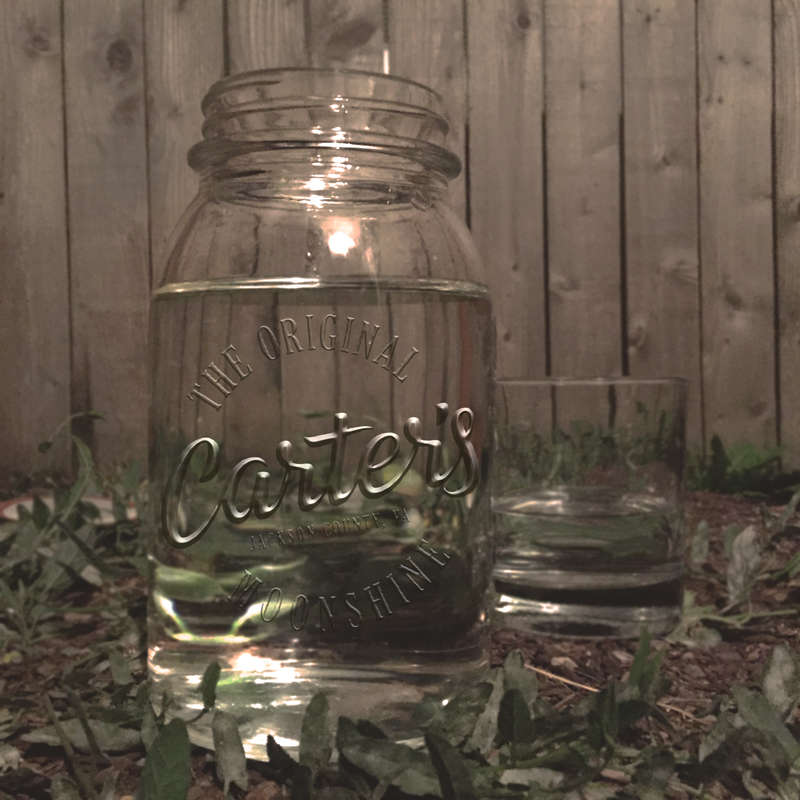
Whether you see the logo on a jar or stamped on a crate, you know a good time is about to be had thanks to the time-tested and perfected Carter’s Moonshine.
Are you interested in working with me on your own branding identity?
Let's talk!
