
Texas Branding Research Identity
Overview
Texas Branding Research is a fictional marketing company based in San Antonio, Texas. They focus on helping businesses both new and old establish successful branding that will make their clients successful in the future by helping them establish goals are and define who their targeted audience is. In this project, I created a new visual identity for Texas Branding Research that would capture a major culture of Texas (ranching) but also help them attract their targeted audience of business owners both new and experienced who need TBR’s professional experience in helping them establish a solid brand.
Process
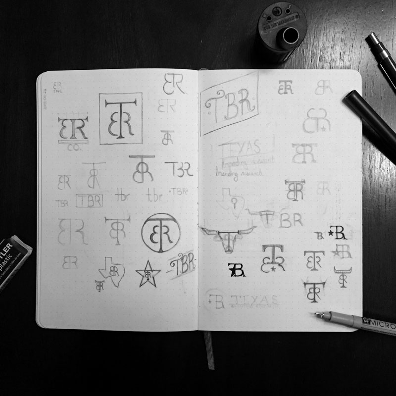
To help capture the history and spirit of Texas as well as the company name, creating a visual identity that paid homage to the cattle ranchers would be a good direction. This meant doing some research into branding irons and the history of their design.
With my newfound knowledge, I started sketching thumbnails for the logo with the consideration of the various branding identity applications it will be used: stationery, business cards, signage, packaging, website, etc. Understanding how the visual identity will be used gave me some direction on how versatile the logo needs to be. Considering the vast amount of applications, it needed the ability to be simple but also unique and recognizable.
This called for a combination mark because it would allow them the versatility of having a full logo that they will use most of the time, but when the application needs to be simpler, they can use just the icon while maintaining brand recognition.
Refinement
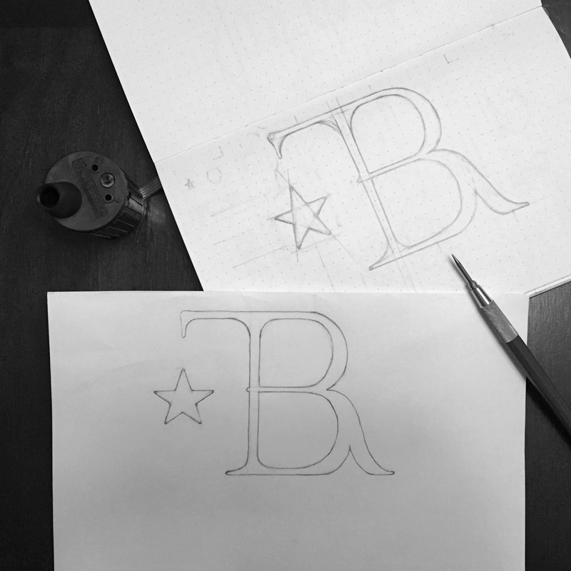
As I worked through my sketches, I found the right direction and drew a larger version. Even though this larger size was easier to work in my details, I still wasn’t satisfied with that iteration, so I traced and refined the logo a few more times until I had a version worth scanning.
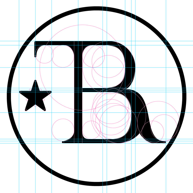
With my sketch now on the computer, I built a vector version of the logo utilizing the golden ratio and applied the final revisions to the details of the icon.
Digital Version
With my sketch now on the computer, I built a vector version of the logo by tracing over my drawing. This provided me with a skeleton of my drawing which I then adjusted all of the curves and shapes using the golden ratio to create a harmonious appearance throughout the icon.
With the icon finished, I needed to add the name to complete the visual identity. Since the icon was done with a hand-lettered serif type, I decided to use Museo Sans, a clean, modern sans serif typeface for the name. This easily complimented the icon and created a professional, yet personable feel for the identity.
Unique Characteristics
In cattle branding, the ranchers will commonly blend the initials of their ranch name together to make a unique shape. Considering this, I blended the T,B, and R together to keep with the Texan theme.
The use of serifs and their spurs also pays homage to the Texan farmers and ranchers.
The star is added not only to represent the Lone Star State, but also to show what my client specializes in; making their clients outshine the competition and attract their clients by being honest to who they are. It also serves visually as a counterbalance to the connection of the bowl of the B and leg of the R, which was quite heavy.
The slight 5 degree rotation shows that Texas Branding Research uncovers every angle for their clients; they don’t stop at what they can see from the outside. They dig into their client to find what truly fuels the business to find out they work and how to improve their brand.
Since the icon is based on a hand lettered serif typeface, the name needed to be in a complimentary sans serif type to create a balance and establish a clean, professional appearance.
Finally, for the color, I had picked out an iron-like blue gray. Blue traditionally serves as a more professional color, and considering iron used for branding irons, it was fitting. This shade of gray also works great on both white and black making the logo very versatile on any background.



Final Concept

The resulting visual identity I created pays homage to the state of Texas (where the business is located) through various characteristics of the logo.
It also attracts their professional target audience visually through use of a versatile combination mark using a classic icon and complimentary modern typeface.
Finally, this visual identity communicates the effect Texas Branding Research has on their clients showing that by the time they are finished working with their client, their client will be the star in their field with a full understanding of their newly-established or refreshed brand.
Are you interested in working with me on your own branding identity?
Let's talk!
